Design Inspiration: A Clockwork Orange
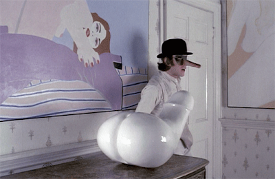
I first saw Stanley Kubric's A Clockwork Orange when I was 15. Even though I was shocked by the violence in the film, what really got my attention was the wonderfully bawdy and colorful set designs. Based on the 1962 novel by Anthony Burgess, it was filmed in 1971 and set in the not too distant future. Its always interesting to see what is considered futuristic design when looking at films from the past. Much of the films decore is sexually explicit...especially in the cat lady/yoga instructor's home. It must have been the filmmakers thought that in the future, people would be more open to sexual displays...wow, how wrong they were! Seems like like people are more uptight than ever about sex nowadays....but I digress...back to the movie sets. Here are some inspirational photos from the film that have really inspired me in my decorating scheme....although I will admit...there are no penis statues to be found in my home. I managed to find a very interesting website which discusses what happened to many of the items and artwork used in the film.

Lots of fun, erotic art in the yoga/cat lady's home, but the color scheme
is definitely feminine.

The yoga/cat lady's home....filled with erotic artwork. I've been
trying to find out what happened to all the artwork used in the film.

Another view of the living room....very futuristic. Love the keyboard on the left,
the big chair in the right hand corner and the rug.

The orange and yellow kitchen. Love the vibrant colors here.
The daisy on the table makes me smile. This orange color inspired
me to go with bright orange in my own kitchen.

For a split second I thought that it was a shag carpet on the wall...
but on closer inspection, it looks more like textured wallpaper.

Ok..odd picture, but the wallpaper is rather psychadelic. My parents had
similar wallpaper in the bathroom back in the 80s.

A scene from the korova milk bar...erotic fun.

Love the mirrored wall with the black and white checkered floor.
Creates a very striking image.

Wild furniture...looks more like space pods than seating. I'm reminded of
an episode of 'Seinfeld' where Kramer wants to build levels in his apartment...
could he possibly have had something like this in mind?

Another view of the Korova milk bar. I would never go overtly sexual with my decor,
but I think it would be fun to have a mannequin in my home that I could dress up.
I don't have one yet, but I do have a wig head which models a beehive hairstyle
and rhinestone rimmed glasses.


Comments
Hope this gives you some inspiration for your room.
The above link is to the entire house tour. I love the orange walls, the spaghetti swag lamp and of course that fabulous LP room divider.
It's a Michell Hydraulic Reference. Michell Engineering still exists and their turntables are still just as beautiful...
/Christoffer, Sweden
a look. I'm definitely loving the information. I'm bookmarking and will be tweeting this to my followers!
Wonderful blog and fantastic design and style.
Also visit my page; wordpress 3 videokurs
http://www.youtube.com/watch?v=XrsSTYtsxQI